Australian Shareholders' Association
Brand Identity Revolution
Helping the Australian Shareholders' Association sharpen its focus and own a position no one else could claim.
̌
The Australian Shareholders' Association had a problem. Membership wasn't reflecting the size of the retail investor market, and its understated 'asa' monogram mark was easily lost among a sea of other 'ASAs'. To make things more complicated, there was internal debate about expanding appeal from 'shareholders' to 'investors' – a move that risked clouding the organisation's positioning.
Our strategic recommendation challenged this thinking head-on: don't dilute your focus – dial it up.
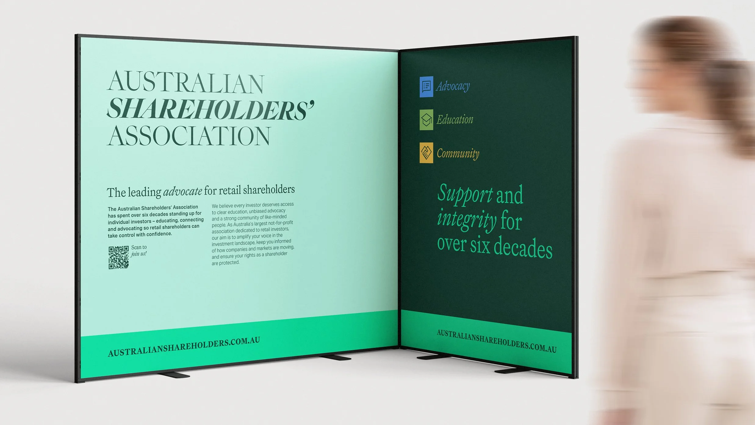
Here's the thing: with current membership at barely 1% of all listed company shareholders in Australia, the opportunity to own a singular, unique and compelling position was sitting right there. The solution was deceptively simple: embrace your full name and declare exactly what you stand for.
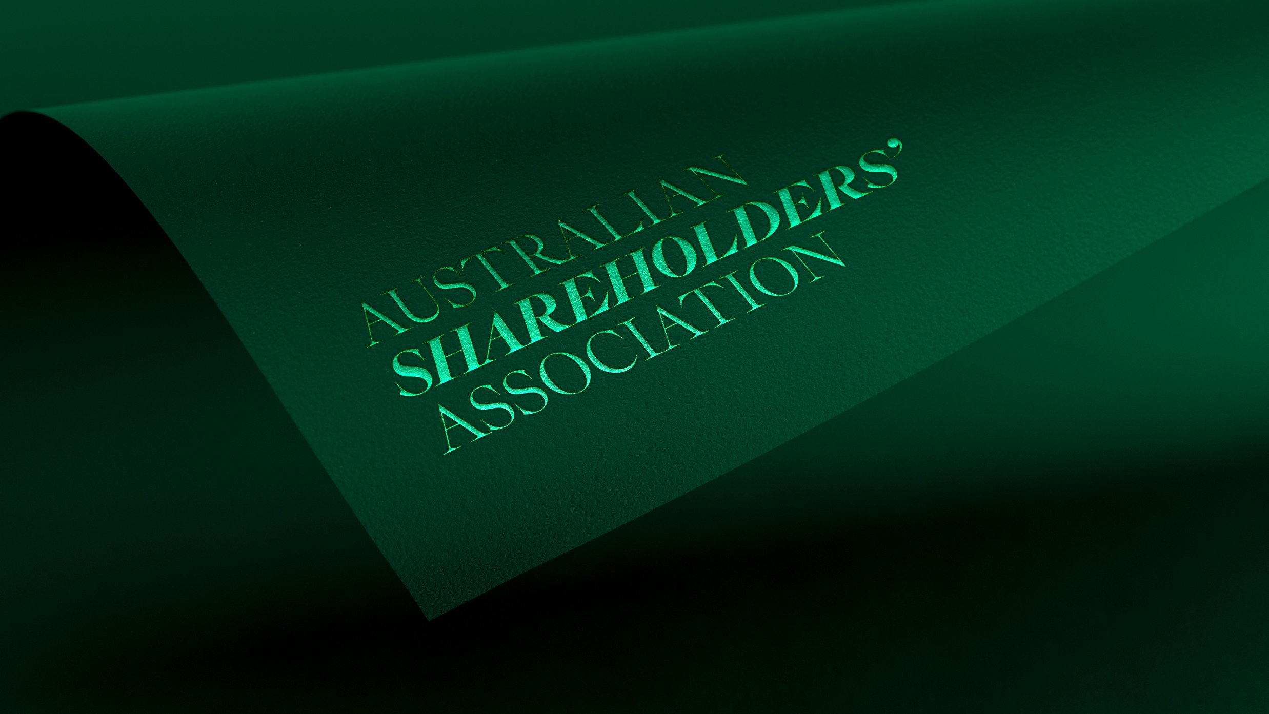
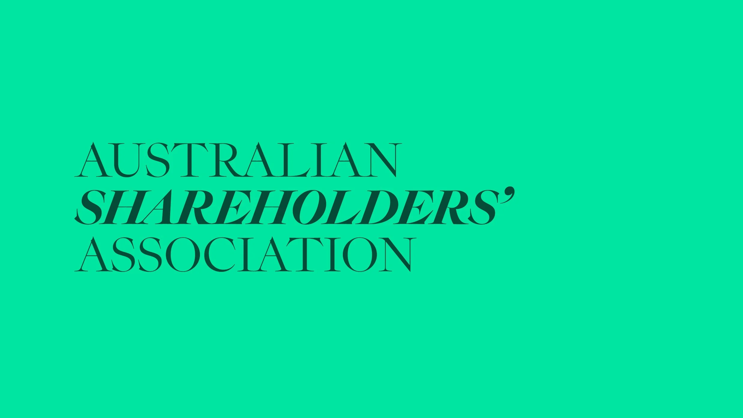
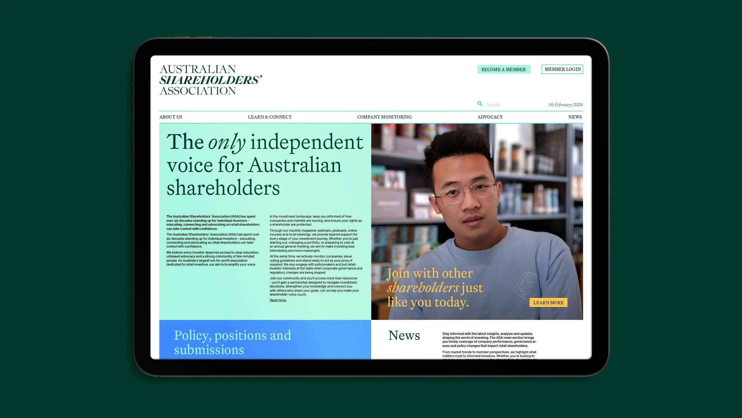
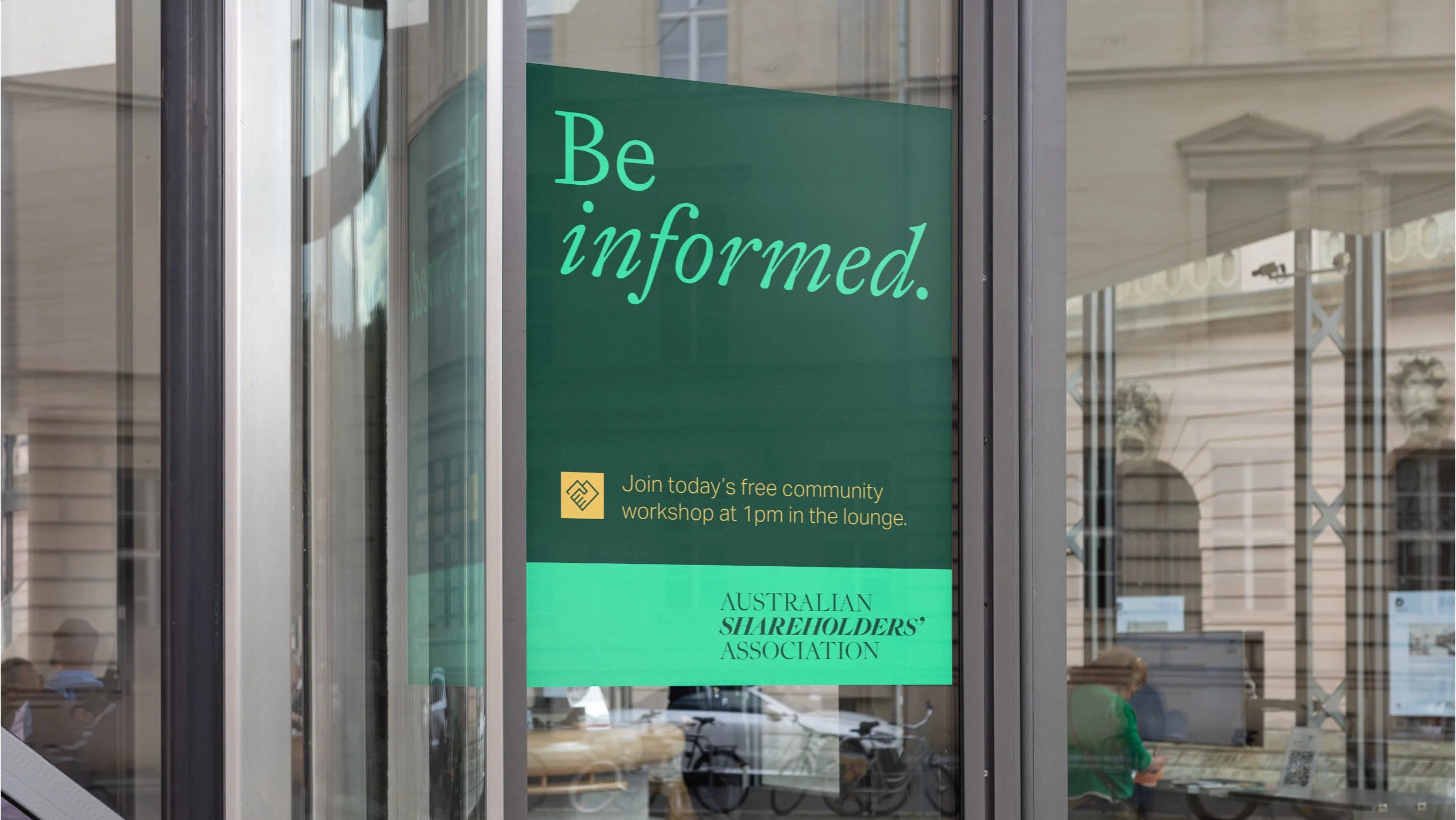
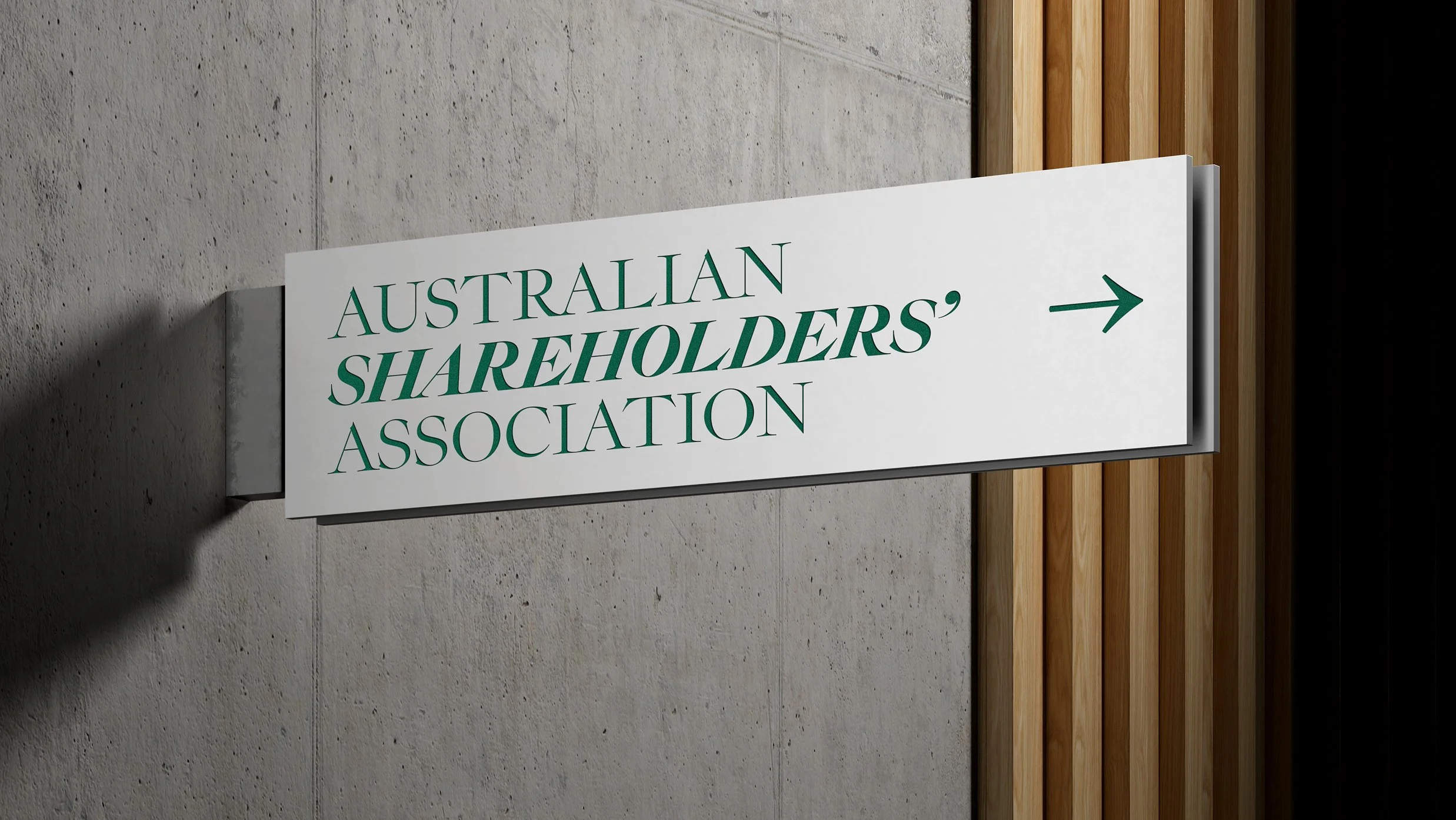
A bold, contemporary wordmark reinforces that confidence – one voice, one association, representing the best interests of every individual Australian shareholder and holding powerful corporate boardrooms to account. No hedging, no broadening the tent to chase numbers.

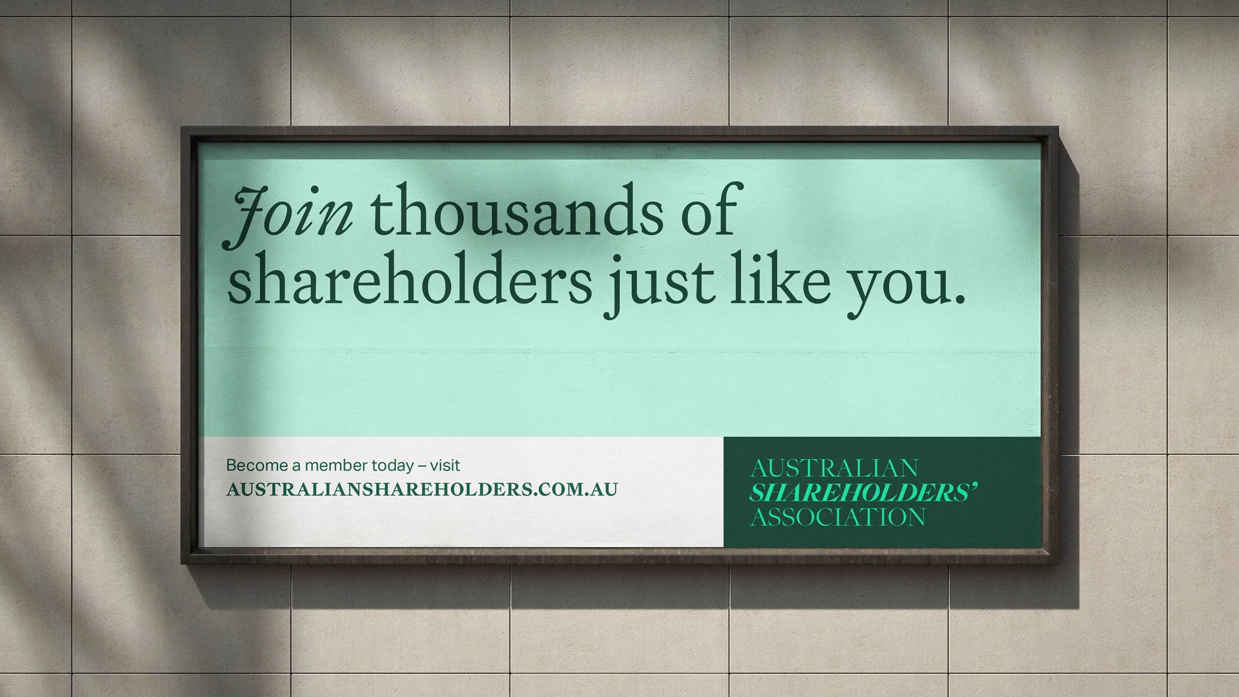
Rather than pursuing a broader audience, the refreshed visual identity and assertive narrative sharpens the Association's unique value. The result is a compelling membership proposition that no other organisation can claim – a clear lane that's theirs alone. By doubling down on what makes them different, the Australian Shareholders' Association is now positioned for growth through absolute clarity of purpose.
Design & Creative Direction Christopher Gough Palmer
Account Director Helen MacKenzie & Guy Whateley
Agency Saturday