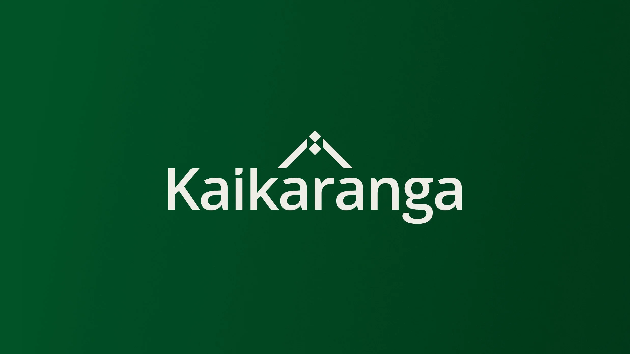
Kaikaranga
Brand Identity Development
Renaming and rebranding Auckland's disability needs and service co-ordinator with a name that honours Te Ao Māori and reflects their evolved role as wrap-around supporters.
̌
Auckland's Taikura Trust had been doing solid work as a disability needs and service co-ordinator, but following thorough research and strategy, it became clear the organisation needed to evolve. The brief was to develop an identity that reflected their broader role as wrap-around supporters for the region's disabled people and their whānau.
After respectful consideration, we proposed a new name: Kaikaranga.
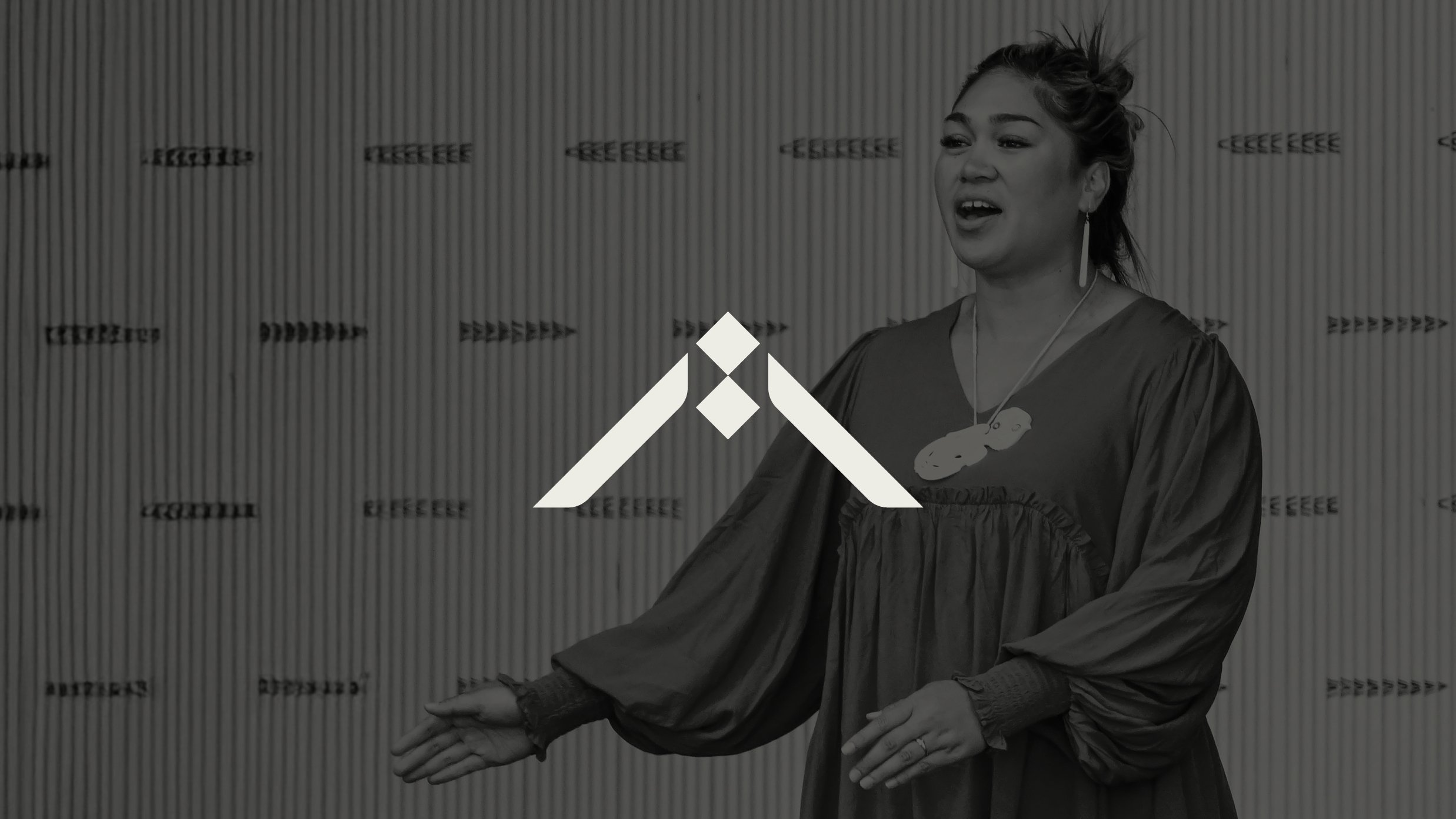
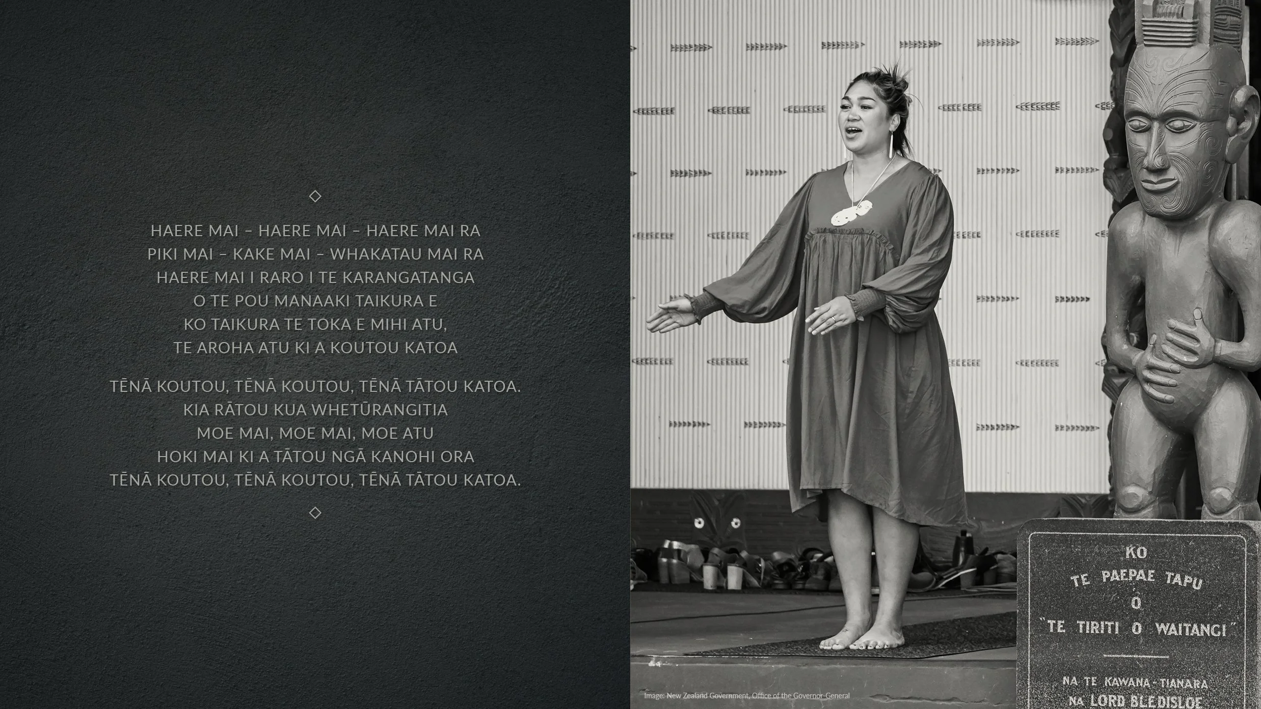
In te ao Māori, the kaikaranga is revered. Hers is the first voice heard on the marae as she delivers the karanga – the welcoming call from the heart that guides visitors to the safety and nurturing embrace of the wharenui. It's a beautiful parallel for an organisation that represents the singular voice for people living with disability.
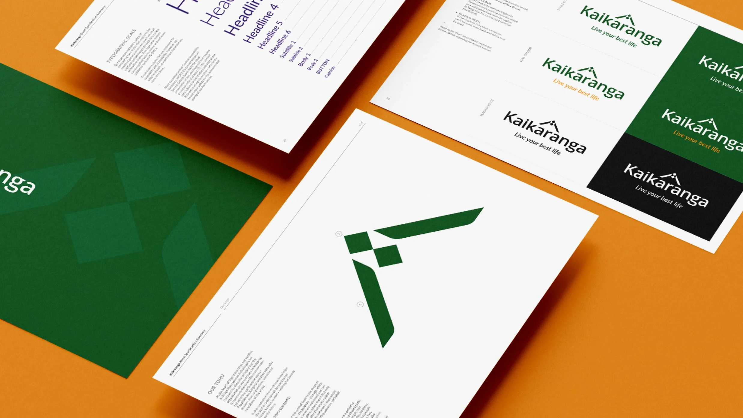
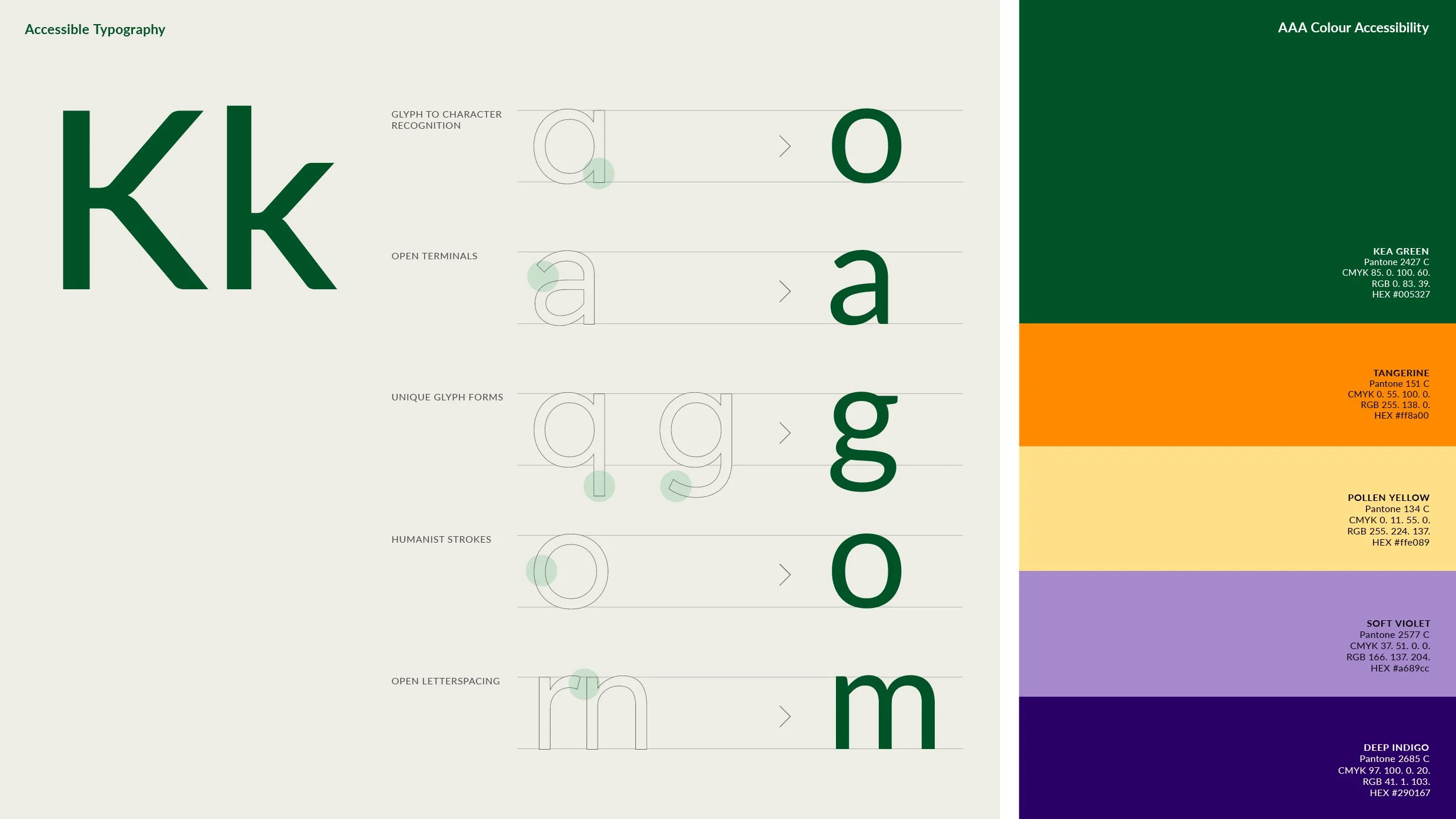
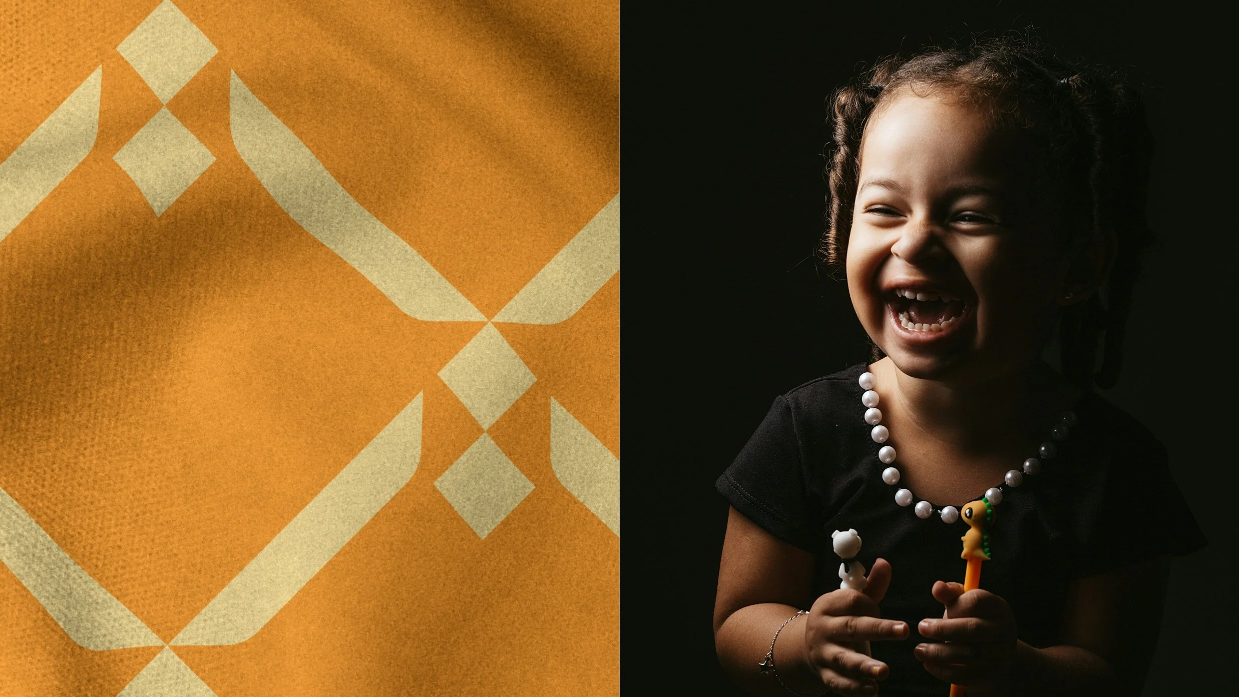
The visual identity reflects the warmth, openness and empathy of the female kaikaranga. The soft logotype, with its generous spacing and open letter forms, offers a welcoming friendliness while meeting accessibility guidelines – because if your audience includes people with visual impairments, you'd better get that right.
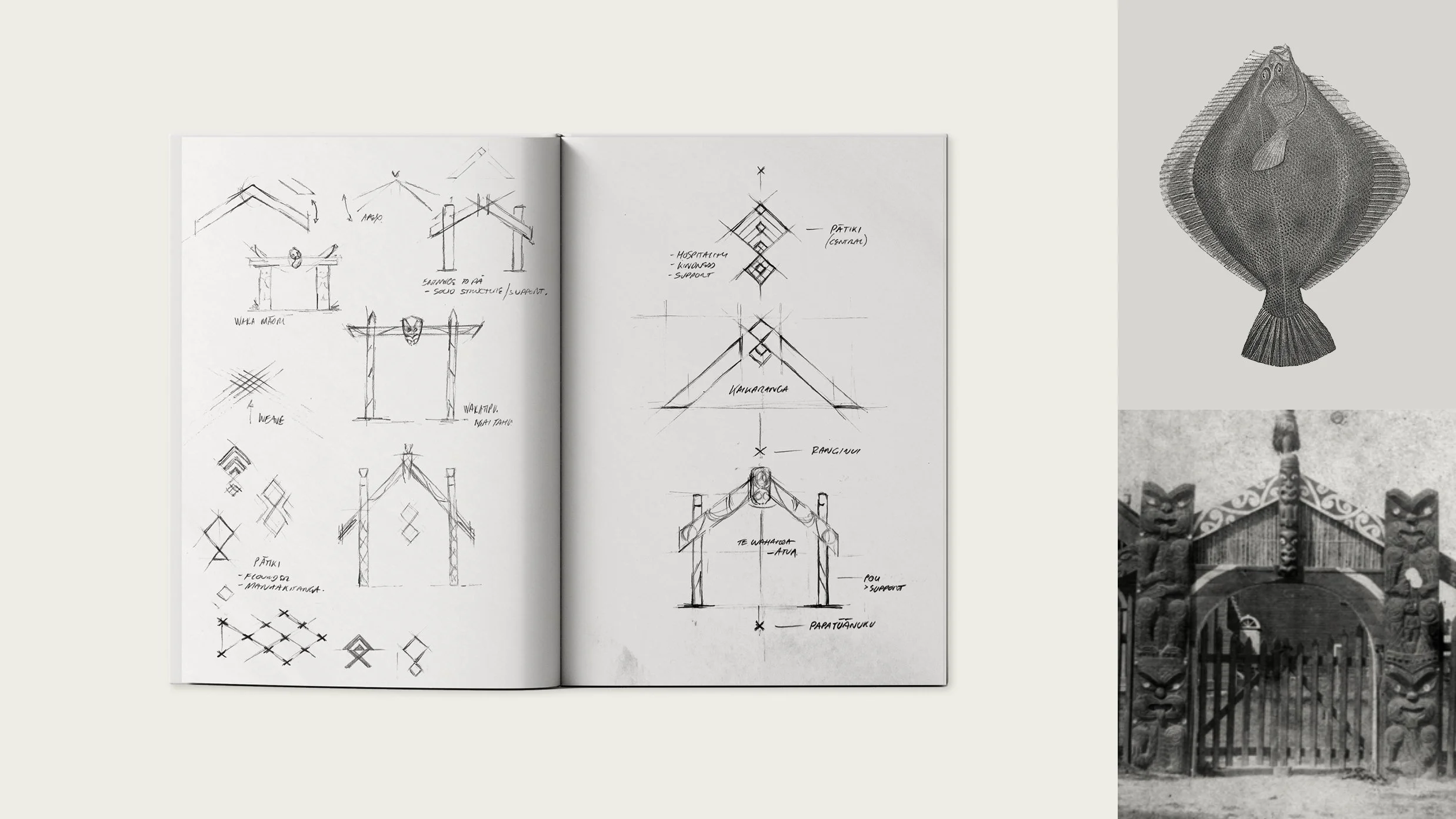
The whare and its promise of sustenance and manaakitanga is also depicted, respecting the connection between the physical and spiritual worlds. The colour palette is grounded in a natural, reassuring green complemented by accent colours that bring vitality, optimism and positivity.
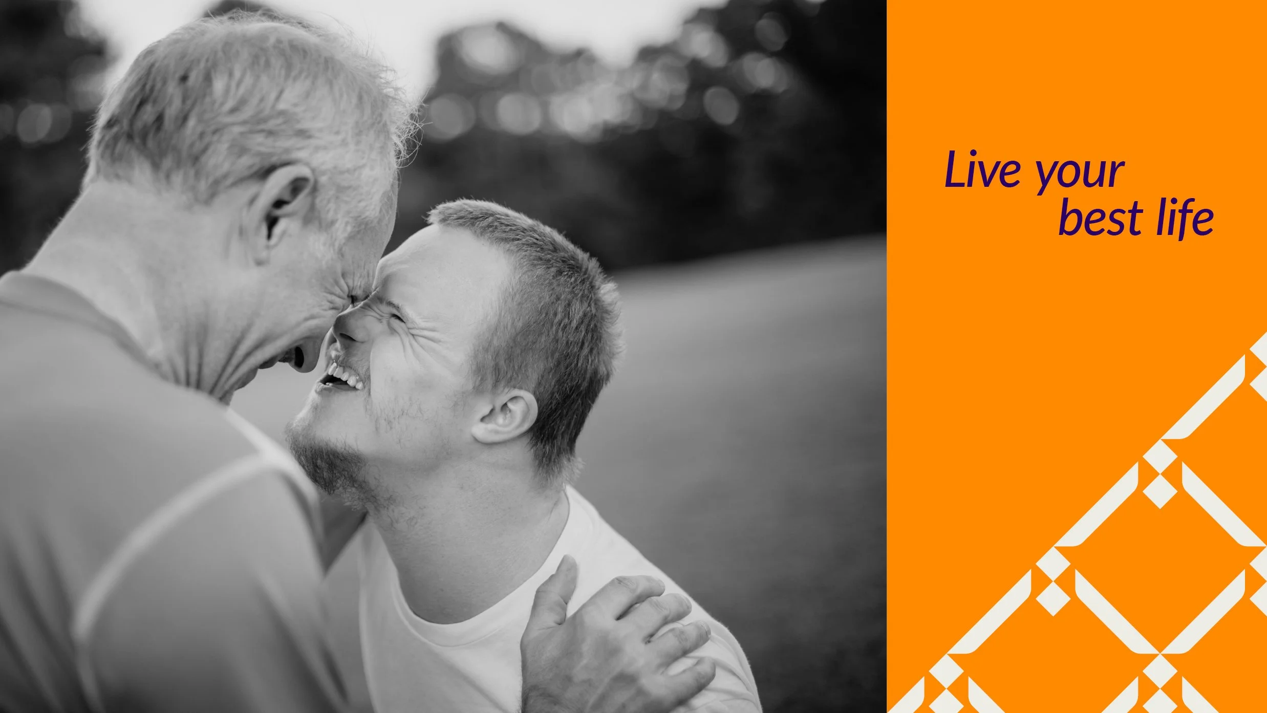
The result: a dependable and balanced identity empowering disabled people to live their lives on their own terms.


Design & Creative Direction Christopher Gough Palmer
Motion Design Sarah Chen
Account Director Helen MacKenzie & Guy Whateley
Agency Saturday